Dice dojo
Web development project
For this project I was required to redesign the interface of a e-commerce store. I chose the Chicagoland Games: Dice Dojo as my client for the redesign. Dice Dojo is an existing online shop that sells board, card and hobby games. The aim of the redesign was to deliver a full front-end protoype that enhanced the functionality and aesthetics of the existing site. It was important to adhere to the ‘Dice Dojo’ brand of being a niche hobby, board and card game shop through the redesign of the website. An analysis of the existing site concluded the website should be more contemporary while maintaining a retro style. A key goal was to make site visually consistent on all screen sizes.
View code on Github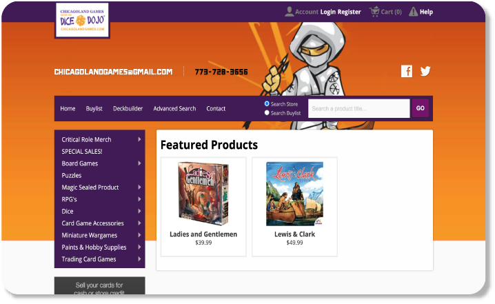
Design process
For this project, I was instructed to choose an exsiting e-commerce wesbite that sells card games, board games and hobbies to redesign. Chicagoland Games: Dice Dojo was the wesbiste I chose to be my fictious client.
This is the logo I redesigned for Chicagoland Games: Dice Dojo
To begin the redesign, I analysed the exsiting site. Below I have outlined the five most critical aspects of the exsiting site design I found;
1. There are too many navigation bars. The placement of them on the screen does optimise screen space.
2. There are misleading functions (e.g. not clearly stating how to remove an item from the basket) and buttons that do not work.
3. Inconsistent alignment of various elements making it feel unprofessional and unreliable.
4. An overwhelming amount of information in each product listing.
5. It is not responsive.
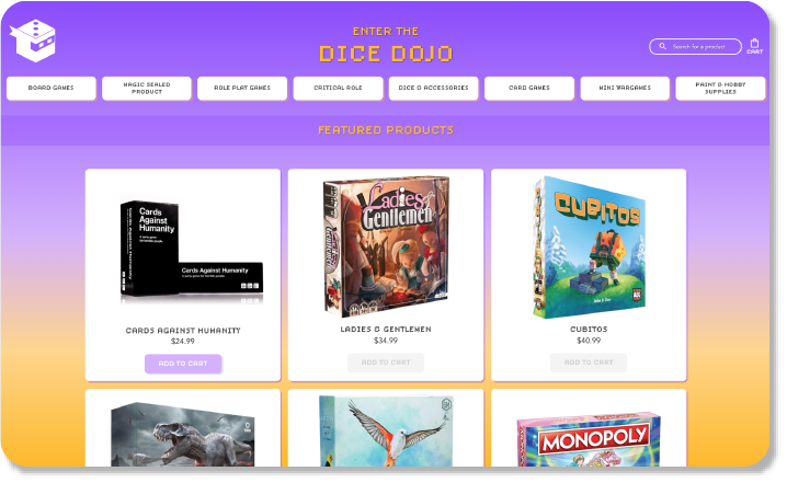
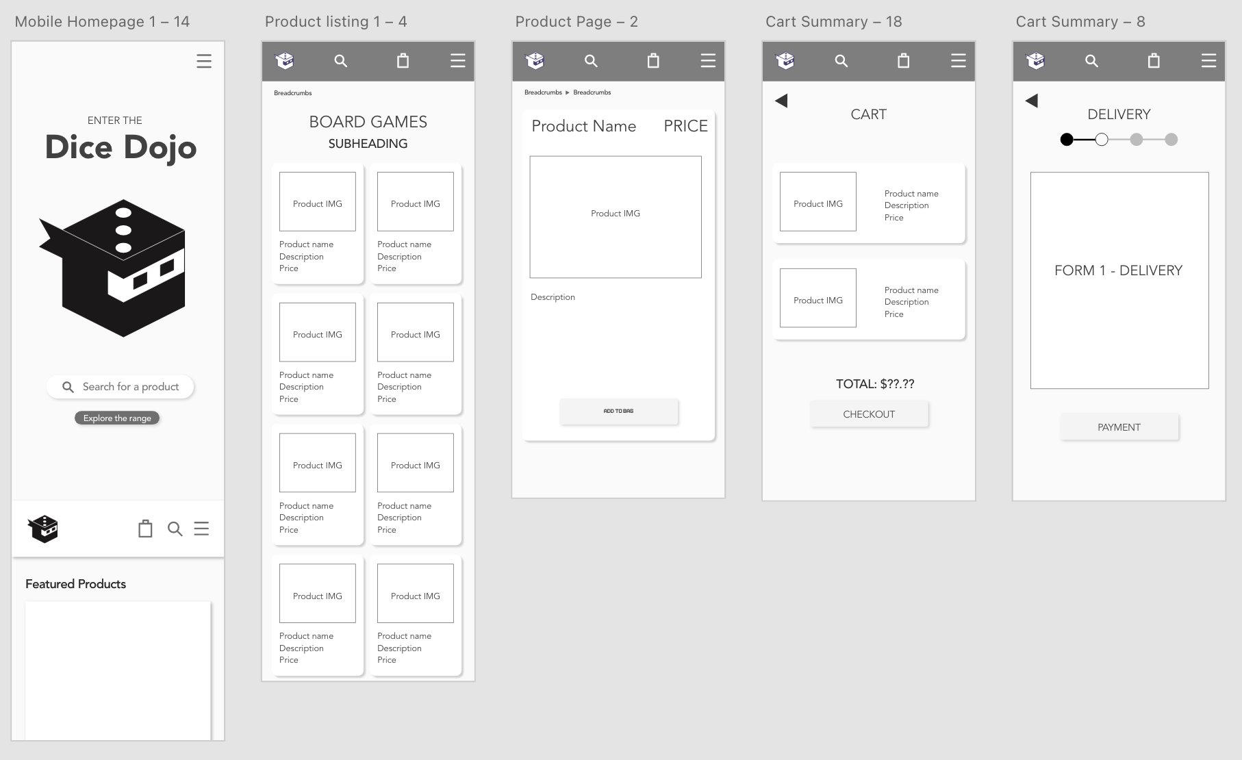
After writing a fictitious creative brief, I began sketching quick wireframes by hand to roughly decide the overall design direction. I then used AdobeXD to make medium fidelity wireframes as seen below.
I also used AdobeXD to experiment with radically different design directions.
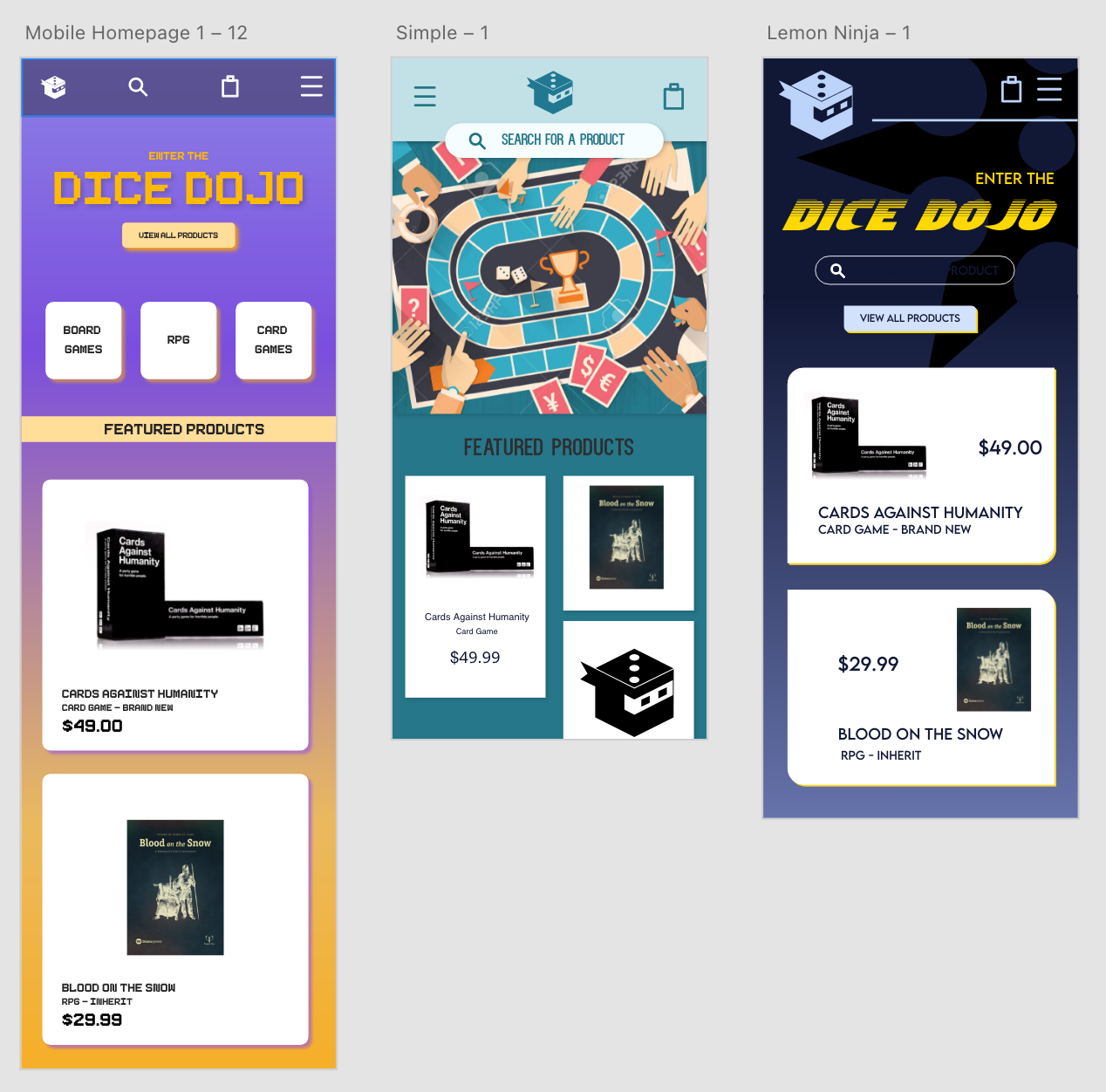
I chose the first design direction because it aligns with the project goals closely. It retains the original colour scheme of the existing website. The combination of purple and orange is quite striking as they are complementary colours, however the background gradient effect gives a modern feel. The typeface chosen is 8-bit inspired. This would appeal to the target market being a ‘niche group’. I like the use of hierarchy in this design. The main heading stands out the most. Nice use of shadows to create depth.
Click here to see my mobile AdobeXD prototypeI then starting coding the full vanilla HTML/CSS prototype as close as possible to the AdobeXD prototype.